Building your big idea

Great essay from Paul Graham…

Empirically, the way to do really big things seems to be to start with deceptively small things. Want to dominate microcomputer software? Start by writing a Basic interpreter for a machine with a few thousand users. Want to make the universal web site? Start by building a site for Harvard undergrads to stalk one another.

Empirically, it’s not just for other people that you need to start small. You need to for your own sake. Neither Bill Gates nor Mark Zuckerberg knew at first how big their companies were going to get. All they knew was that they were onto something. Maybe it’s a bad idea to have really big ambitions initially, because the bigger your ambition, the longer it’s going to take, and the further you project into the future, the more likely you’ll get it wrong.

I think the way to use these big ideas is not to try to identify a precise point in the future and then ask yourself how to get from here to there, like the popular image of a visionary. You’ll be better off if you operate like Columbus and just head in a general westerly direction. Don’t try to construct the future like a building, because your current blueprint is almost certainly mistaken. Start with something you know works, and when you expand, expand westward.

The popular image of the visionary is someone with a clear view of the future, but empirically it may be better to have a blurry one.

(Emphasis mine.)


Comment philosophy on Tumblr

From an interview with David Karp, founder of the Tumblr blog network, I want to highlight a concept where design shapes behavior:

Karp’s thinking about the comments section, which is generally assumed to be a core blog feature, helps illustrate his broader ideas about how design shapes behavior online. Typically, a YouTube video or blog post or article on a newspaper’s site is the dominant object, with comments strewed below it, buried like so much garbage. Thus many commenters feel they must scream to be noticed, and do so in all caps, profanely and with maximum hyperbole. This, Karp argues, brings out the worst in people, so Tumblr’s design does not include a comments section.

How, then, to encourage feedback while discouraging drive-by hecklers who make you never want to post again? First, Karp notes, you can comment on someone else’s post, by reblogging it and adding your reaction. But that reaction appears on your Tumblr, not the one you’re commenting on. “So if you’re going to be a jerk, you’re looking like a jerk in your own space, and my space is still pristine,” Karp explains. This makes for a thoughtful network and encourages expression and, ultimately, creativity. “That’s how you can design to make a community more positive.”

While the imagined rationale for commenters acting poorly because they can’t be noticed easily is a weak cause-and-effect, I find the design response innovative and appealing:

Your readers’ comments are shown on their blog, not yours, thus keeping your blog more positive.

CSS 3 – Box Shadow properties

The box-shadow property in CSS3 allows a comma-separated list of shadow attribute values.

These specify, in order, the horizontal offset, vertical offset, optional blur distance and optional spread distance of the shadow);

Then,  an optional color value and an optional ‘inset‘ keyword.

Inset lets you create an inner shadow, rather than the default outer shadow.

Examples:

  box-shadow: 5px 5px;
  box-shadow: 5px 5px 15px #888;
  box-shadow: inset 2px 2px 2px 2px black;
  box-shadow: 5px 5px #666, -12px -12px #f4f4f4, 0px 0px 15px 15px #cc6600;

These are supported in newer browsers.

Facebook Timeline debuts. Social Overload.

TechCrunch’s MG Siegler wrote something this week that gave me pause:

With the new Open Graph, you’re sharing stuff as you do it. You don’t have to think about it. You’re listening to music on Spotify and it’s being shared with your friends automatically in the Facebook Ticker. The only button you hit is “play”.

There’s one massive problem in the social space: everyone is competing for the same user time. But most services compete by piling on features that erode that time even quicker. They’re offering up services that if I use, it means I’ll have even less time to actually enjoy life. That’s not a sustainable model. Being “social” online has become far too much work.

Facebook has clearly been thinking about this problem. And now they have a way to tap the power of social without thinking about it. That’s the future of the space. It’s not about needing a share button. It’s about not needing a share button.

Given that none of us complain about having too much time on our hands, the investment we make into our social networks (twitter, facebook, grapemojo, orkut, flickr, netflix, and any other forum through which we share ourselves) can feel like it robs us of actually living “real life” outside, offline, away from the computer, with humans in the flesh. (Think about when you last said, “I had a great night out on Facebook last night.”)

Sure, we get satisfaction from posting, sharing, creating and commenting — but anything that reduces the time it takes to do this will be much appreciated.


Using Mac OS Lion (10.7) with Adobe products

Adobe has posted a tech note about how its products interact with Apple’s new OS X operating system.

http://kb2.adobe.com/cps/905/cpsid_90508.html#products

As expected, the glitch-and-bug list is lengthy.

* * *

Macworld posted an article about other Lion glitches and compatibility issues with other Mac programs. Among others:

Finally, Microsoft promises an update to Office in the next few months that will add support for Lion’s Autosave, Versions and full-screen features.


The Auteur vs. the Committee

The Auteur vs. the Committee

From an article in digital domain at http://nyti.ms/qBBIB8

 AT Apple, one is the magic number.

One person is the Decider for final design choices. Not focus groups. Not data crunchers. Not committee consensus-builders. The decisions reflect the sensibility of just one person: Steven P. Jobs, the C.E.O.

By contrast, Google has followed the conventional approach, with lots of people playing a role. That group prefers to rely on experimental data, not designers, to guide its decisions.

The contest is not even close. The company that has a single arbiter of taste has been producing superior products, showing that you don’t need multiple teams and dozens or hundreds or thousands of voices.

A well-known commentator, John Gruber, gave a talk a few years ago about design leadership and creative vision.

 Two years ago, the technology blogger John Gruber presented a talk, “The Auteur Theory of Design,” at the Macworld Expo. Mr. Gruber suggested how filmmaking could be a helpful model in guiding creative collaboration in other realms, like software.


Hype Flash replacement spawned at Y Combinator

The Startup Foundry website published an interview with a software programmer, one of the cofounders, Jonathan Deutsch, of Tumult Co.  He left a job at Apple to launch a startup.

I was faced with the decision of continuing to work with the great people on my team on a clearly high impact project, living with the “what if” syndrome, or trying to forge my own path.  ”Regret Minimization” is what should win out in life, so it did.  I had done a lot of different projects at Apple, and felt I made my mark both internally on the company and externally on Mac OS X.

About his experience at Y Combinator:

YC is definitely worthwhile. The network effects are staggering… it gives any YC company an advantage in making the right contacts, finding investment, and being in a support net with others in the same boat. And if you’re starting a company, why wouldn’t you want every advantage available to you? Paul Graham, Paul Buchheit, and Harj Taggar all give great advice with brilliant ideas sprinkled in. The dinners are fun, and there’s a lot that we learned from the speakers. Most founders would come early before each dinner just to hang out and discuss their startups or demo their products. The atmosphere is electric and contagious.

Visit the Hype website. Unfortunately for Mac OS Leopard (10.5) users, the app requires 10.6. A bad decision for many thousands of us.

Google makes new image format

But fails to support Alpha channels (for true transparency)!

Firefox maker rejects the format, and will not support it until changes are made.

WebP’s lack of basic feature parity with JPEG in areas like metadata handling and ICC color profiles is identified by Muizelaar as another major problem with Google’s format. It also doesn’t add any important features that JPEG lacks, such as support for an alpha channel. He goes as far as using the phrase “half-baked” to describe the deficient WebP feature set.

Adopting a new image format in Web browsers is a big decision. Once a format becomes a part of the Web, it will have to be supported in perpetuity—adding overhead to the browser—even if it largely fizzles and only gains a small niche following. The chances of WebP attracting widespread use at this stage are very limited, so it seems prudent to avoid shoveling it into the browser.

Read more at arstechnica.com.

A post published on Google’s official Chromium blog last week highlights a number of quality improvements in the implementation and discusses the growing number of third-party adopters. Most significantly, Google is adding WebP support to its own Web applications—including Picasa Web Albums and GMail.

Review of 5 Website Wireframe Tools

I recently decided to review our website wireframing/prototyping techniques to see where we could be more efficient in getting from concept to code. We currently use Dreamweaver’s Site tool and/or Fireworks or Illustrator for mockups.

The follow survey highlights some new wireframing and mockup tools. My main criteria was having the tool export the wireframe to html so that we could upload to our own servers for testing and client review.


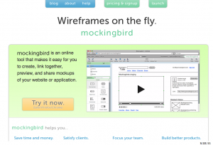
Mockingbird

https://gomockingbird.com

Their description: Drag and drop UI elements to the page, then rearrange and resize. Go from idea to mockup in minutes. Link multiple mockups together and preview them interactively to get a feel for the flow of your application. Share a link and your clients and teammates can edit with you in real time. No more emailing images back and forth.

Price: $9/month Basic to $99/month Expert plans.

Cons: does not export to actual html for a true click-through web schematic.

Pidoco

https://pidoco.com

Their description: A GUI Design Software for clickable Wireframes. Fast and easy like Rapid Paper Prototyping, but completely web-based and with many more features. Advantages: Clickable Wireframes; Fast and easy Prototyping; Easy Remote Usability Testing; No Software Installation. Products & Features: Interface Prototyping; Prototype Reviewer; Remote Usability Tests; Realtime Collaboration.

Price: $9/month Personal to $85/month Unlimited plans.

Pros: has versioning. Online review tools with user commenting. Usability testing built in!

Cons: does not export to actual html to load a click-through web schematic to your own server or the client’s.


Denim

http://dub.washington.edu:2007/denim

Their description: An Informal Tool For Early Stage Web Site and UI Design.

Price:  free

Pros: standalone program for desktop PCs. Exports as HTML.

Cons: does not look to be current (last mod date 2008). Uses our own handwriting to make the mockups.


Pencil

http://pencil.evolus.vn/en-US/Home.aspx

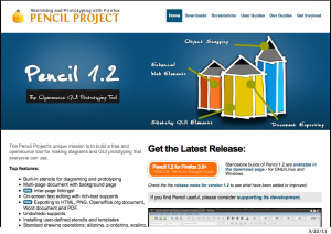
Their description: The Pencil Project’s unique mission is to build a free and opensource tool for making diagrams and GUI prototyping that everyone can use. Top features:  * Built-in stencils for diagraming and prototyping * Multi-page document with background page * Inter-page linkings! * On-screen text editing with rich-text supports  * Exporting to HTML, PNG, Openoffice.org document, Word document and PDF. * Undo/redo supports * Installing user-defined stencils and templates * Standard drawing operations: aligning, z-ordering, scaling, rotating… * Cross-platforms * Adding external objects * Personal Collection * Clipart Browser * Object snapping * Sketchy Stencil

Price:  free

Pros: Firefox plugin and standalone program (via XULRunner, but not for Mac). Sketchy-like look and feel.  Exports site as HTML.

Cons: Unintuitive initial screens; hyperlink fields have no obvious URL field until a new “page” is created within the document. No site-wide export as HTML without arcane steps to install a so-called “template” of some kind. Not ready for prime time.

Wireframe Sketcher

http://wireframesketcher.com/features.html

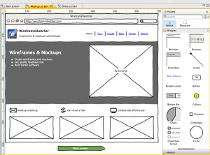
Their description: WireframeSketcher is a software tool that helps you quickly create wireframes, mockups and prototypes for desktop, web and mobile applications. It comes both as a plugin for your Eclipse-based IDE and a standalone application. * Create wireframes and mockups * Get quality feedback fast * Build better software * All using your favorite Eclipse IDE * 45+ built-in UI controls * rough, unfinished, hand-drawn look for your mockups

Price: Trial (watermark on exports), $75 one-time buy.

Pros: standalone program and plug-in for many IDEs. Very cool sketch look. Nice toolset.

Cons: No HTML export. Complicated to begin; following the tutorial is essential.